top of page
CANADIAN SPACE AGENCY

Background
The Problem
The Solution
Timeline
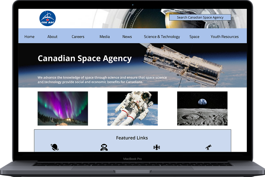
My design bootcamp was given the task of redesigning a government website to be more user-friendly and engaging.
After performing a heuristic evaluation and several user tests, I realized that the main problems with the Canadian Space Agency website were the circuitous navigation system and the overall lack of a pleasing aesthetic.
A completely new navigation system separate from the parent canada.ca website and a complete overhaul of the aesthetic of the website.
3 weeks
CONNECT WITH KAYLAH: klangburt17@gmail.com
bottom of page